



LOGOS & TYPE
|
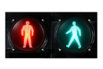
Walk/Don't Walk
1974 Regulations introduced the figures across Europe. |
|
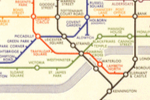
London Underground Map
1933 Designed by Harry Beck. Influenced all public transport maps since. |
- Canadian Flag
1964 - Ampelmännchen
1961. East Berlin's traffic light men - Johnston Underground Font
1916. Font designed for the London Underground
by Edward Johnston & Eric Gill - Berlin Underground signage
1990. Designer: Erik Spiekermann, MetaDesign. - Swastika/Nazi Image
1920s/30s. OK, not very PC, but the clothes, flags, writing and paraphenalia are all very distinctive. Classic Evil. - Hammer & Sickle
1917. Adopted by the Soviets. - Peace Symbol
1958. Designed by Gerald Holtom. - The Face magazine
1981. Designer: Neville Brody.
Not 20th Century
- @ (the 'at' symbol first appeared 1536)
- Red Cross (1864)
Logos
Many people nominated logos as 20th Century classics. And it is true that the logo came into its own in the 20th Century classic. However the first of the modern logos was the Coca-Cola logo, which dates from 1886, so unfortunately this does not qualify.
Maybe logo design, in general, could be called a 20th Century classic.
Logos that were specially nominated included:
- Red circle with oblique (forbidden) and Give Way sign
Both become part of standardisation in the UK's "Motor Car Act" of 1903 - London Underground Roundel
1908 - Batman logo
by Bob Kane, 1939. - MacDonalds logo
1962. Logo based on the "golden" arches used at their stores since 1949. - Adidas logo
1972
Here are a selection of other logos from the 20th Century (date undetermined).


