


Flags of the World
The Best Flag – finals
The finalists for the best national flag in the world are…

Barbados

Canada

Chile

Czech Republic

East Timor

Israel

Jamaica

Japan

Macedonia

Pakistan

Sweden

Turkey

Vietnam
Starting to be highly critical now, the first of the finalist to be eliminated are…
Czech Republic – no charge.
Chile – the one charge is in canton, there is nothing central.
East Timor – only has detail in the hoist, nothing central and is quite modern, not classic.
Israel – the division of the field is non-standard. Either there are two thin blue strips or two white borders.
Macedonia – it has a non-standard charge "throughout", a little too busy.
The final eight
Barbados
Canada
Jamaica
Japan
Pakistan
Sweden
Turkey
Vietnam
Head to head
I'm going to pit the similar looking flags against each other.
Barbados
Canada
The concept of the flags of Canada and Barbados are similar, but the proportion of their stripes are different. Barbados is 1:1:1, Canada is 1:2:1. While the Barbados flag's proportions are more classical, this leaves less room for the one charge. From a design perspective I think this makes the Canadian flag superior in this case. Barbados gets knocked out.
Jamaica
Sweden
Sweden shares a similar charge with Jamaica, a yellow cross throughout. Jamaica is just that little more interesting. Also Sweden shares it's style with it's Nordic neighbours. It's not particularly unique. Sweden gets knocked out.
Japan
Vietnam
There are only five flags which feature only a circle, and only two where it is red, and only Japan with this precise arrangement. Whereas there are at least nine flags that feature a singular five-pointed star in the centre, even three others with a yellow five-pointed star. Also, Vietnam shares yellow stars on red with China. Although both classic, Japan has the edge on originality. Vietnam gets knocked out.
Pakistan
Turkey
This is a tough one. Both are really good flags with slight quirks. But I think because Turkey is more classic and Pakistan is just that bit more quirky, this round Pakistan get knocked out.
Japan
Turkey
There are only two other flags that feature a large circle on a singular field, but both of these have their circle off centre, so in this Japan is unique. Although the exact arrangement of Turkey's crescent and star is unique there are six other nations that have very similar arrangements and six that have white crescents. I think for the pure classicness and uniqueness, Japan wins this round. Turkey is knocked out.
The final three
Canada
Jamaica
Japan
Third place
Because its saltire throughout make it look just like another field division, and because it uses green (the least bold of the traditional heraldic colours), third place goes to Jamaica.
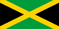
Jamaica
Second place
Because it has a field division and because the maple leaf is a little complex to draw, second place goes to Canada.

Canada
WINNER
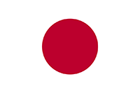
Japan
Classic simplicity wins. I'm surprised, as when I started this I thought that Canada would have won. Yet I have tried to honestly assess what I thought were good and bad design decision and it seems that simplicity, boldness and uniqueness have won the day.